
PAYONE - Payment solutions provider
✍︎ UI/UX Design, User Testing, Accessibility
✐ Figma, Tumult Hype
⚐ Rollout of redesign with a newer look and feel; better information architecture and fewer clicks; significant improvement in the navigation perception
Below is an overview of a project that I heavily contributed and rolled out, the website of the payment solutions provider PAYONE. The company is one of the top 2 leading businesses in its branch in Germany and also a strong player in the European market, with around 5.4 billion transactions/year.
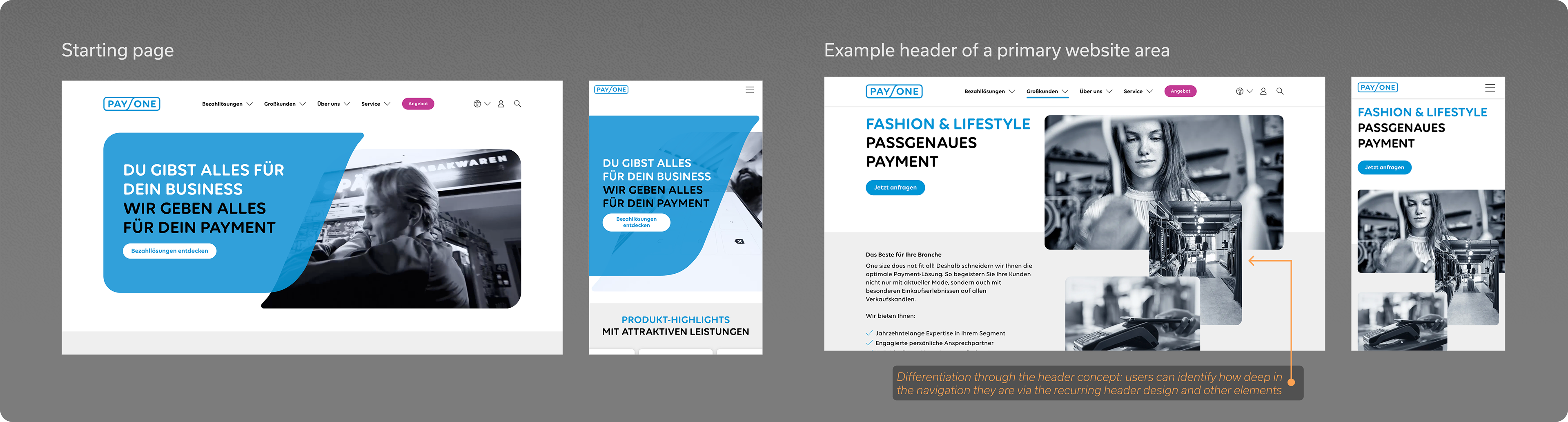
Starting page and header concept
As it is the most important touch point with a new user, the starting page was one of the initial updated sections which I participated in. The new animated header element brings the image and the shape together symbolising unity, movement and modernity, captivating the attention directly.
Not only the starting page, but all the website headers are a crucial part of the design concept and user experience. We developed a strategy where the four hierarchical levels of navigation (starting page, intermediary pages, detailed pages, offers) have each a different signature style, which allows the users to recognise in the first blink where they currently are in the navigation. The usage of more or less elements, abstraction vs mood images and size also varies with the intended purpose of each page.
Here is short summary of the main aspects I worked on for this section:
• Designing a responsive UI, including very small and large viewport sizes;
• Creating an animated prototype for the initial animation, for testing purposes;
• Exploring how to create a modern collage style for the primary areas;
• Detailed specification and guidelines for the programmers, including implementation support.
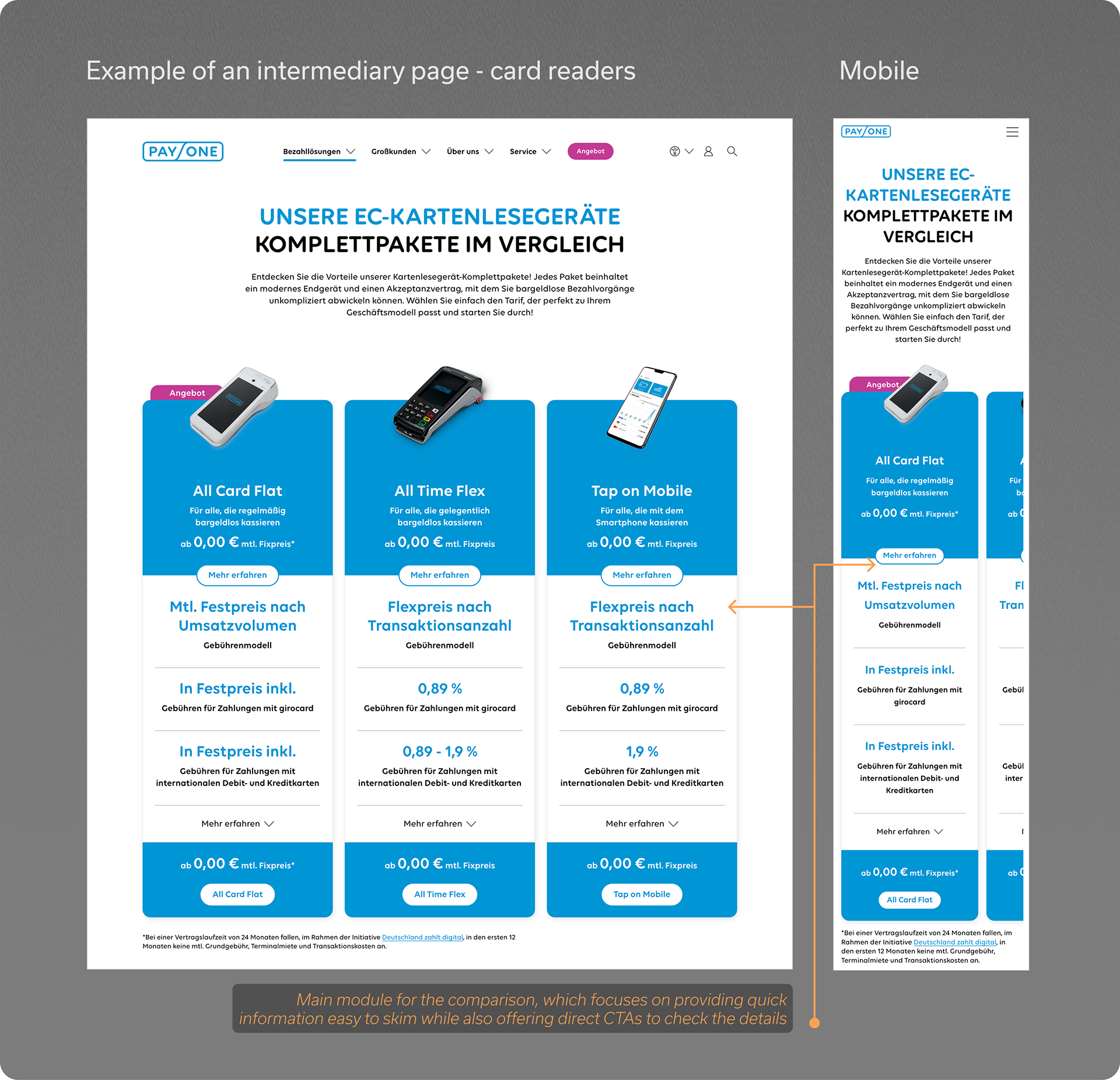
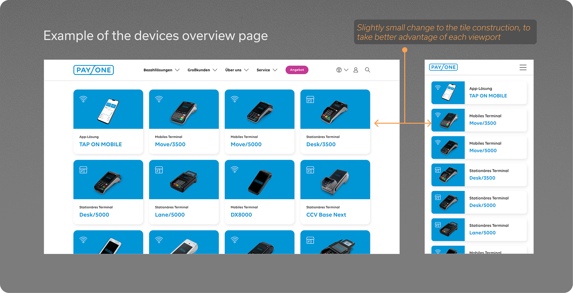
Intermediary pages - exemplary with card readers and devices
Another area of the website which I was able to contribute to were the intermediary pages. As it happened with most of the sections of the project, the main workload was to develop widgets, modules, tiles and other elements that would comprise a comprehensive system.
Both of the specific pages shown below focus on the devices which accompany the payment solution plans, however they have distinct functions: on one hand, the card reader intermediary page on the left aims to provide a quick comparison overview of the options for the customer; while the devices intermediary page on the right comprises a more pragmatic listing of all the devices, which can then be selected for troubleshooting information.
These pages also represent well the challenge of adapting the website responsively for smaller viewports while preserving the look and feel and usability as much as possible. In some cases simply "downsizing" the text and other elements was sufficient, where in other cases an alternative structure was necessary to take the best advantage of each viewport.
In summary, my main tasks involved:
• Designing a responsive UI, including very small mobile viewport sizes;
• Making sure that the design offered a good balance of highlighting certain elements in a more business point of view, while also maintaining it relatively neutral for the user;
• Specification and implementation guidelines;
• Testing for consistency and best user experience;
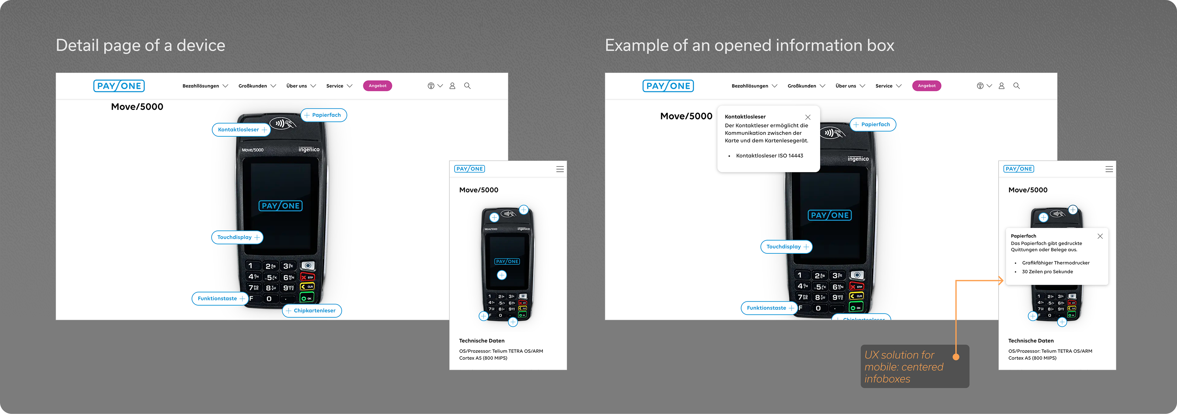
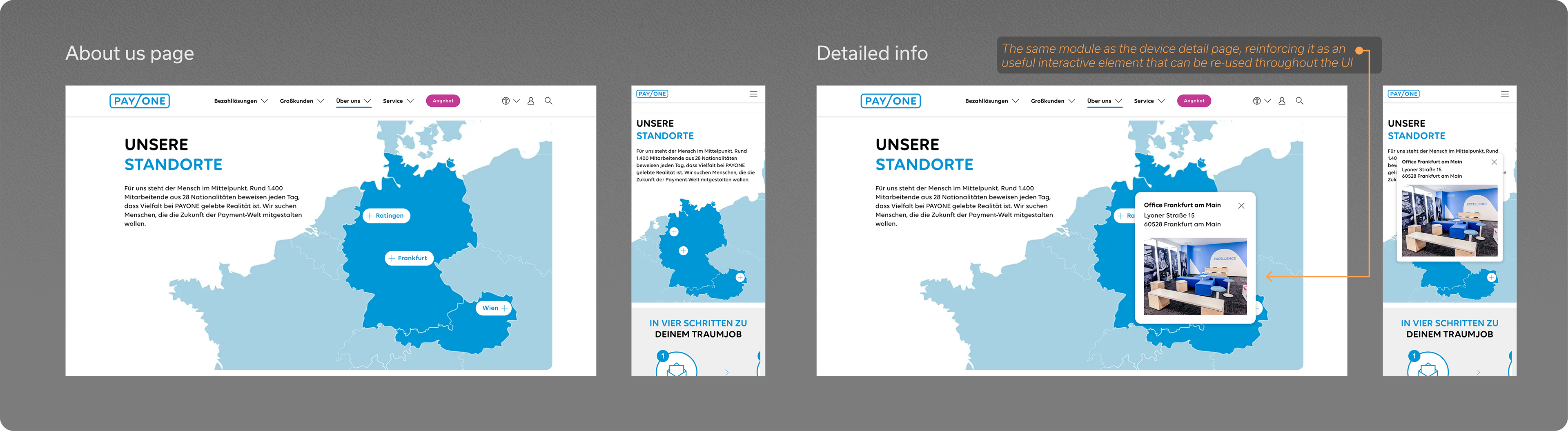
Detailed pages
Finally, the images below show a collection of some of my favourite detailed pages that we worked on. Each of these posed a different challenge as the level of granularity and specificity asked for different solutions. Nevertheless, we managed to even so come up with modular reusable elements such as the interactive module with "content bubbles" seen below on both the device and about us page.
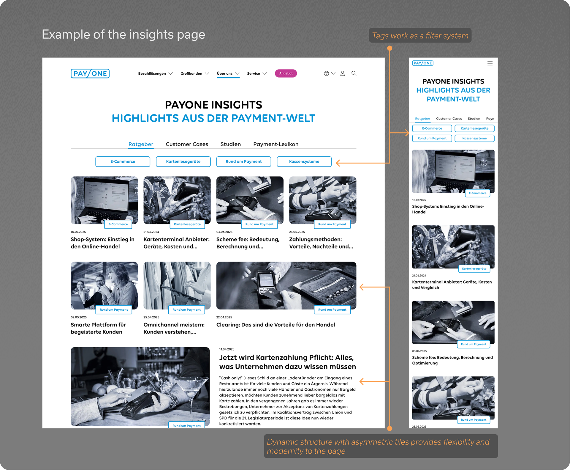
The insights page, on the other hand, asked for a dynamic tile structure in order to best accommodate the news content while keeping the black and white photo style of the branding in a harmonious visuality.
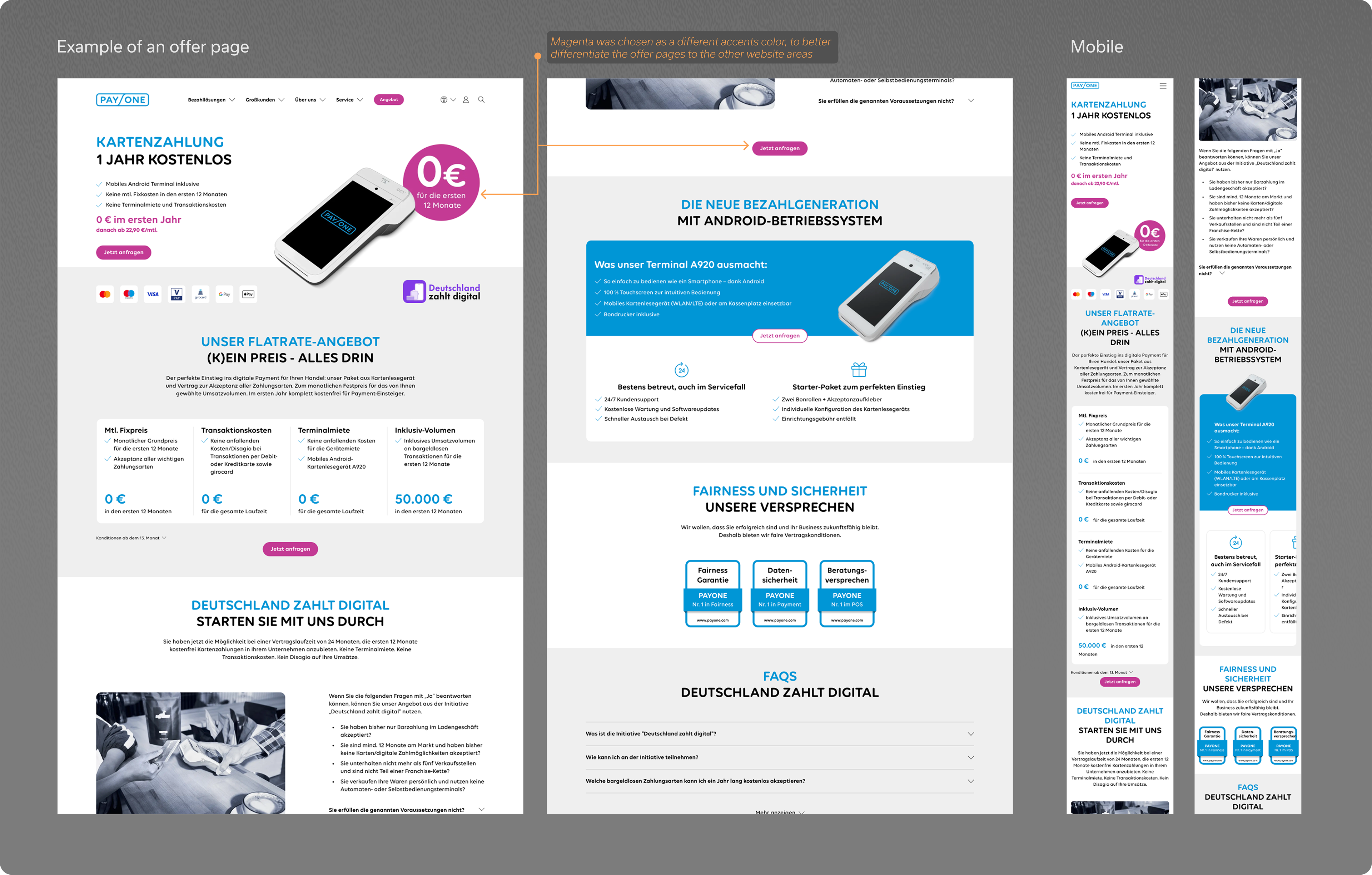
Lastly, the offer page shown below also pictures a clever use of the branding elements seen throughout the website, which is the usage of the magenta tertiary colour. Here, the decision was to use it only on the pure business pages where for example offers or prices are shown, indicating to the end user that the page is presenting important information for the decision making process of acquiring a payment solution.
Summarising the main fields of work here:
• Designing a responsive UI, including very small mobile viewport sizes;
• Module creation, competition research, mood-boards and technical specification for the implementation;
• Usage and expansion of the branding guidelines;
• Testing different layouts for min. and max. cases of content amount, as well as evaluating the reusability of the modules;