Konrad Krieger Institut Brand Identity
✍︎ Branding ✐ Photoshop, Illustrator, InDesign
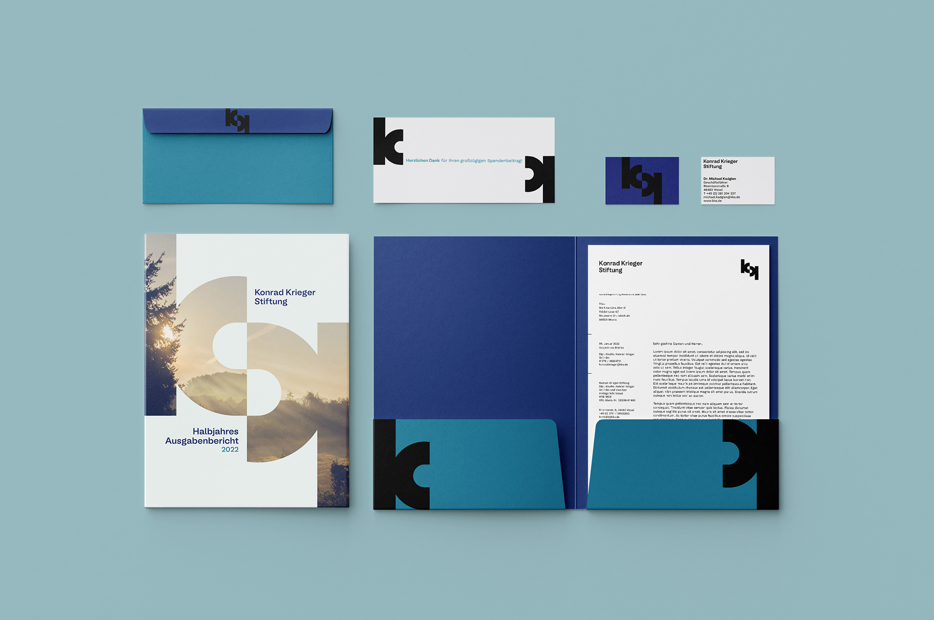
The following branding was executed as a university project and competition to create the corporate identity for the Konrad Krieger Institut in NRW. The institute provides promotion and funding for many projects in the fields of natural preservation, education, culture and many more, especially in its home region of Niederrhein.
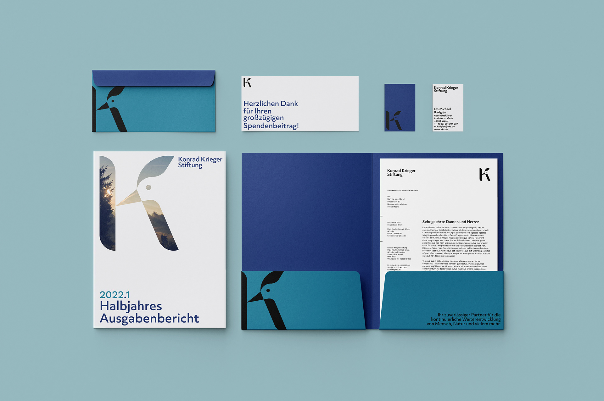
Our task was to develop a proposal for the main branding elements and stationery, in accordance to the institute's values and motto.
After defining the branding direction (subtle, modern, accessible, flexible and simplified), I ended up creating two different approaches, where the foundational elements remained the same almost the same, having two alternatives for the main logotype and different primary typefaces.
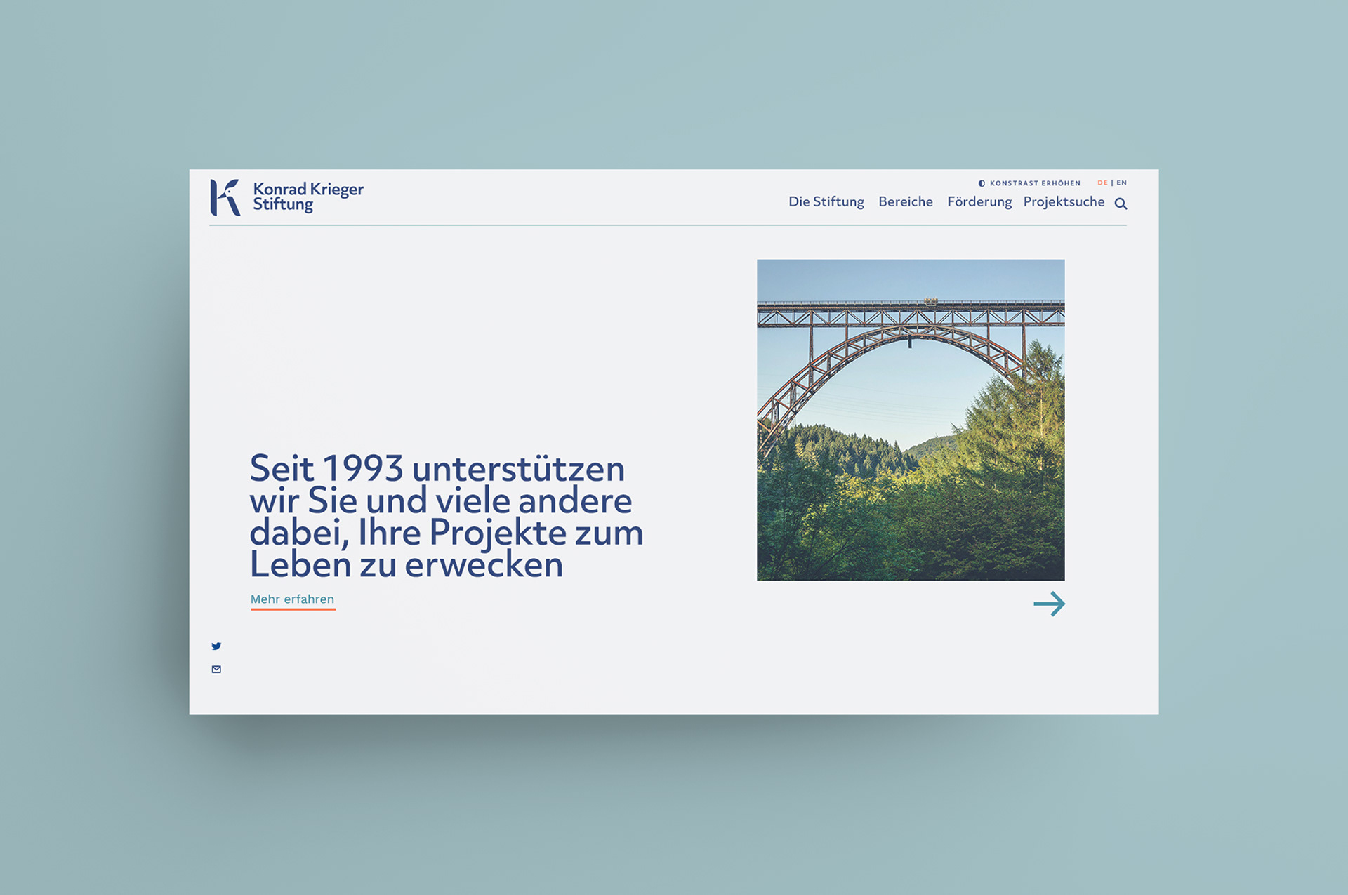
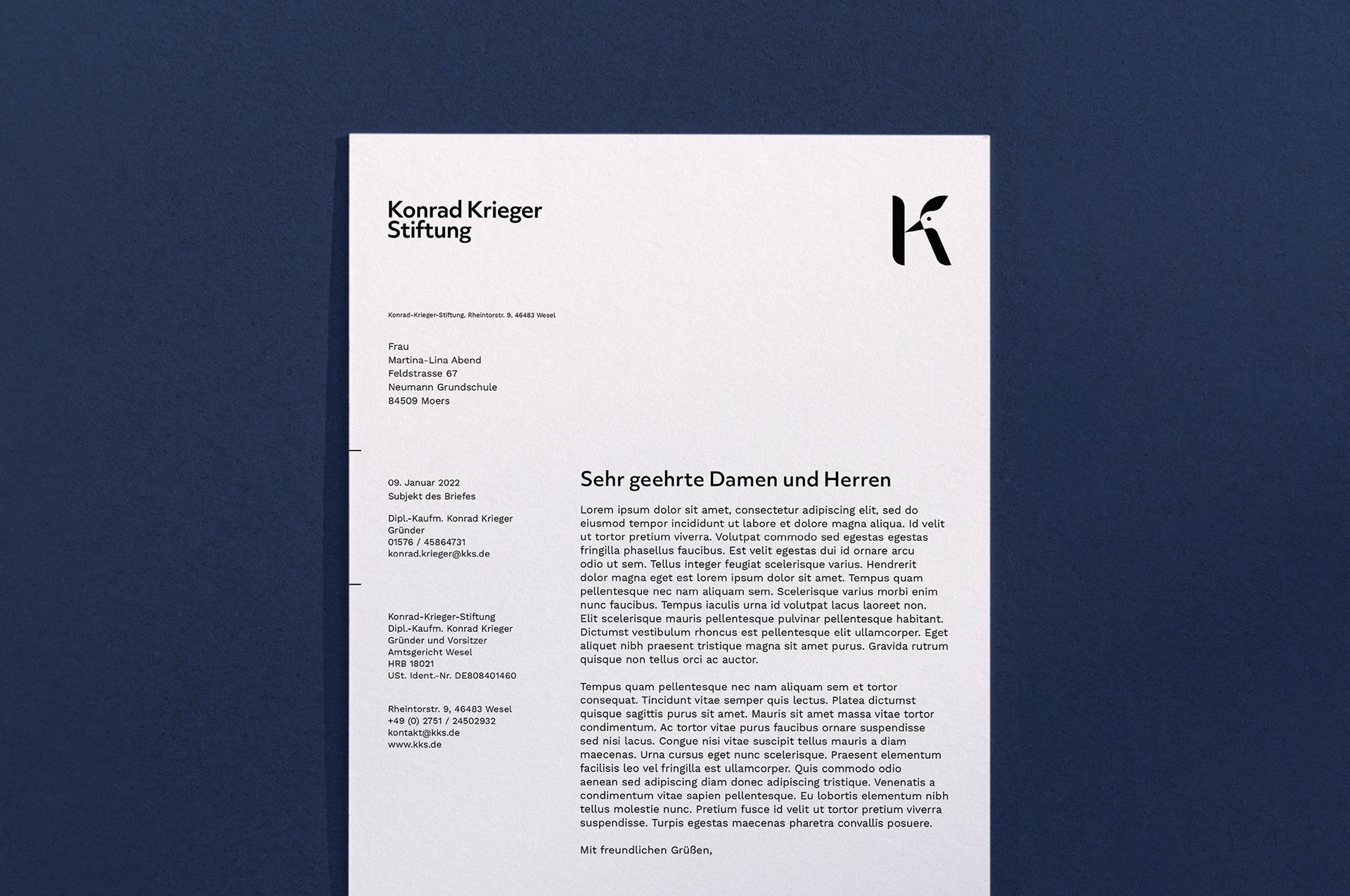
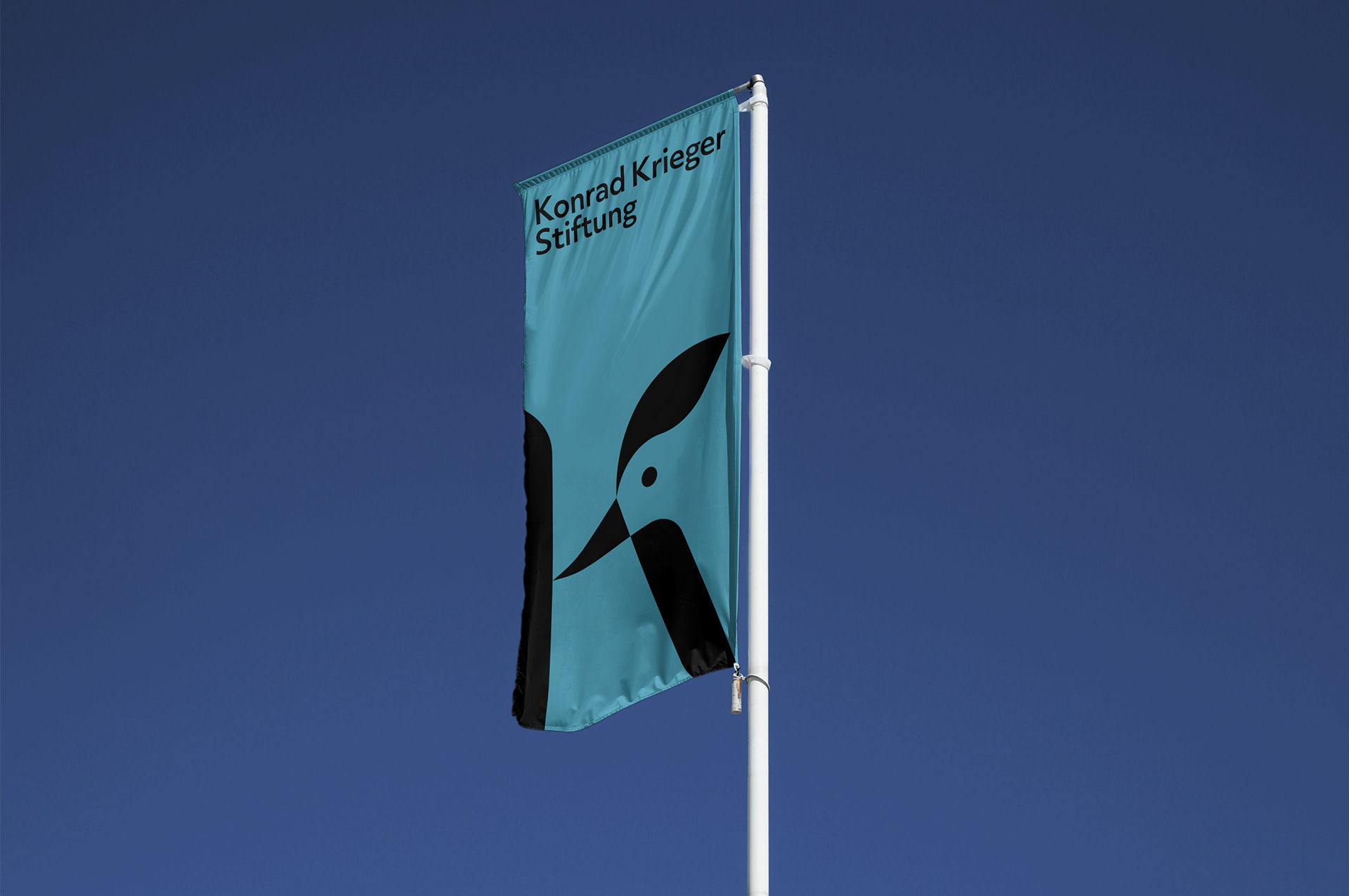
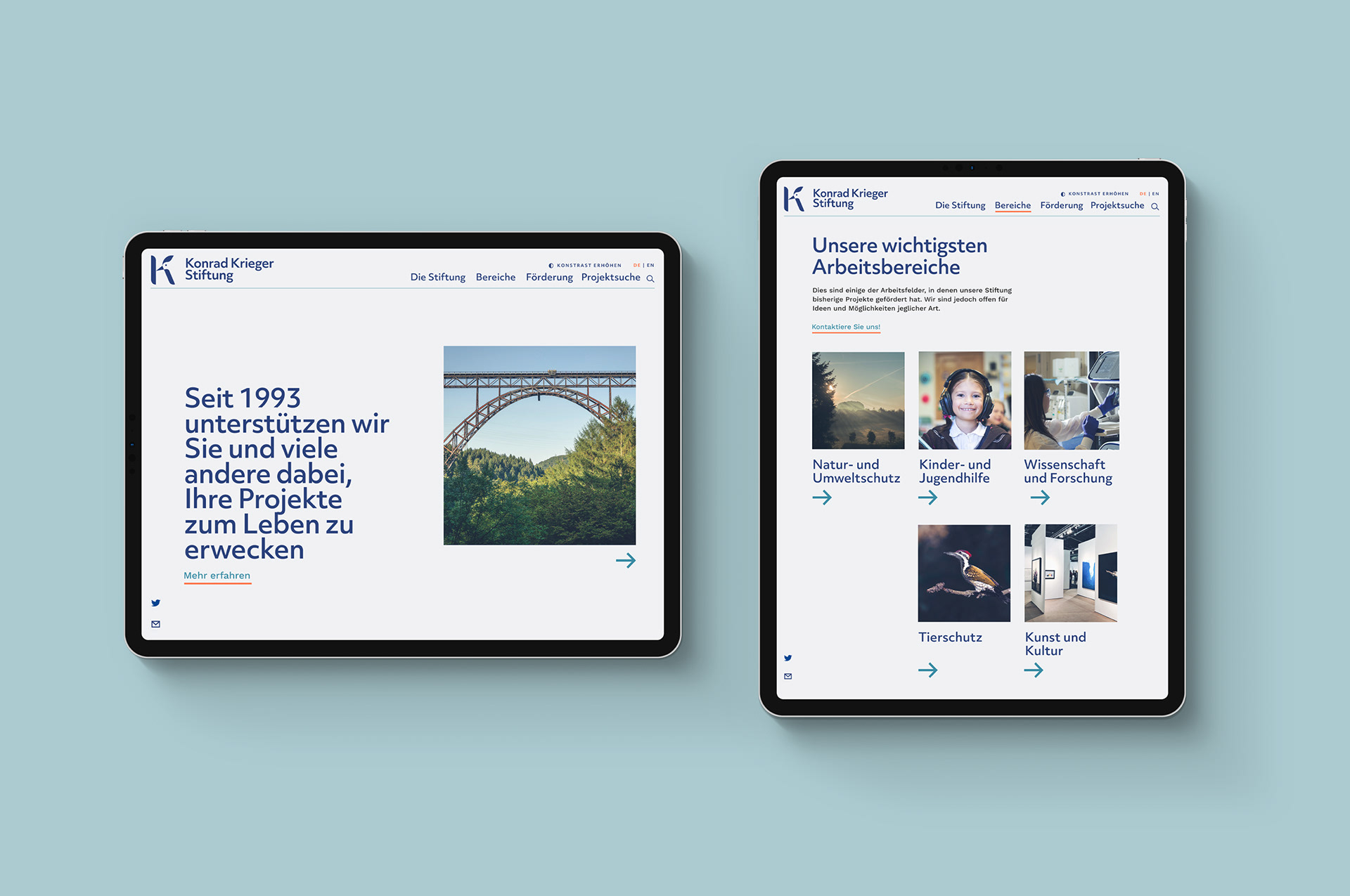
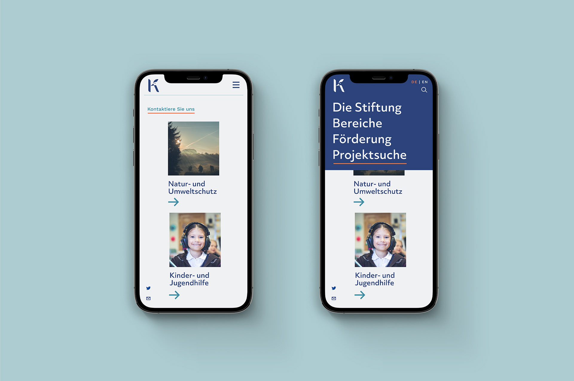
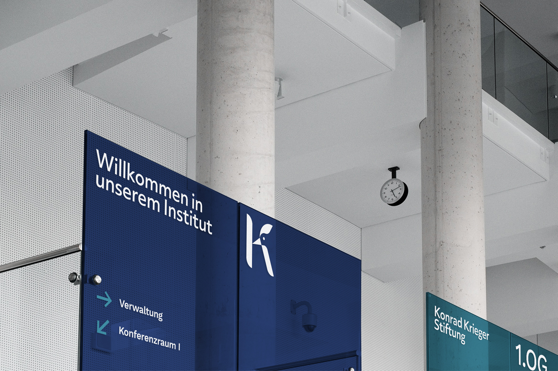
Briefly explained, the first approach combines the letter K of the founder's name, together with the Schwarzspecht (black woodpecker), a typical animal of the region. This way the concern of the institute with the natural preservation is accentuated, while maintaining a clean but somewhat fun mark.
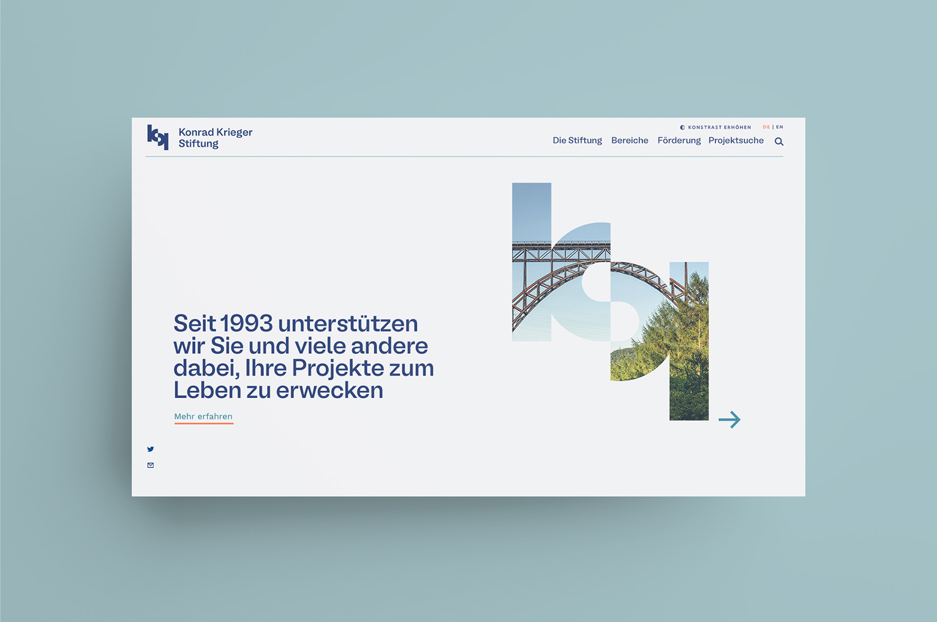
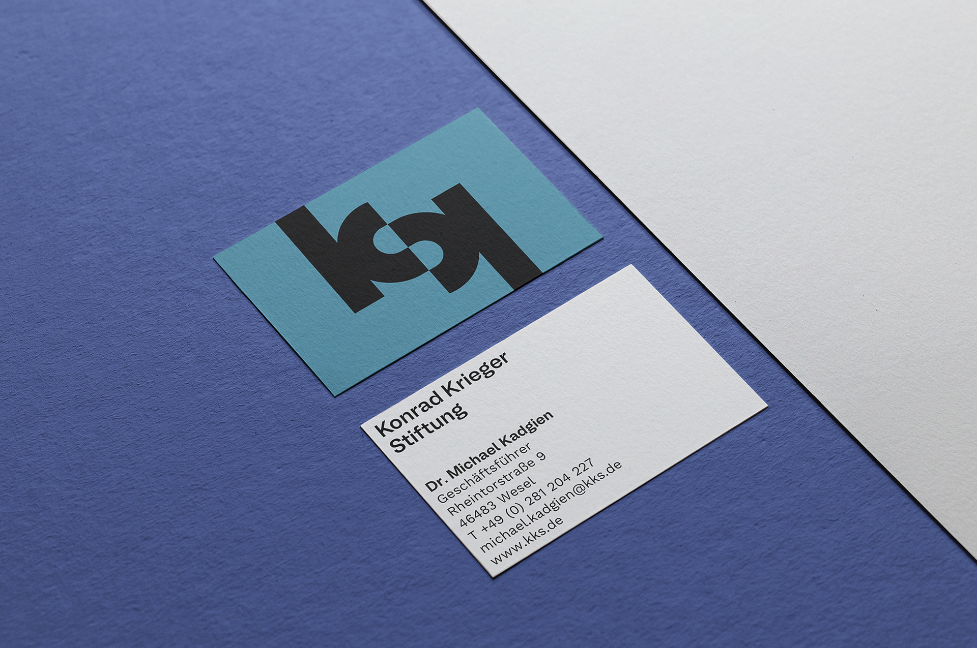
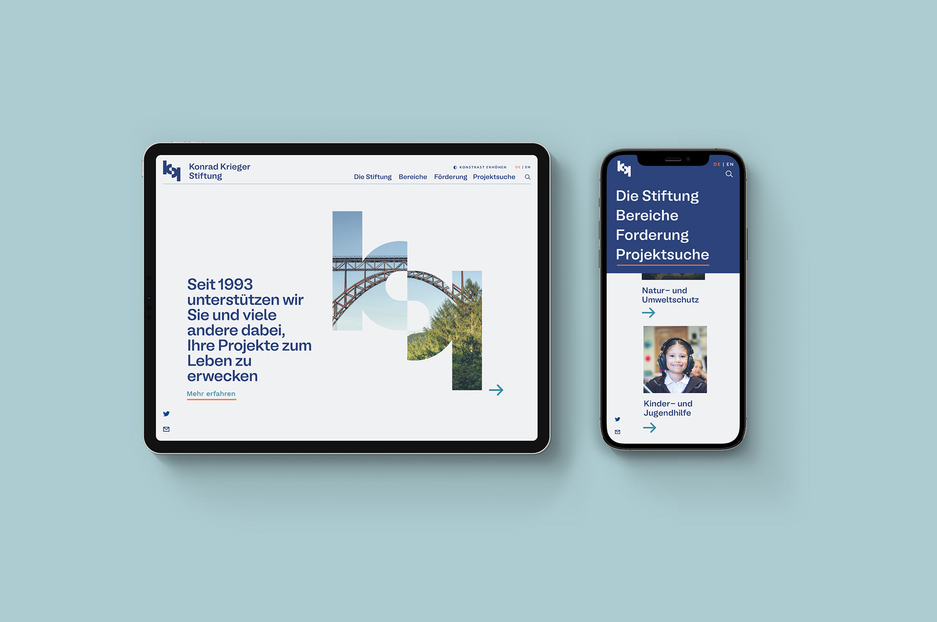
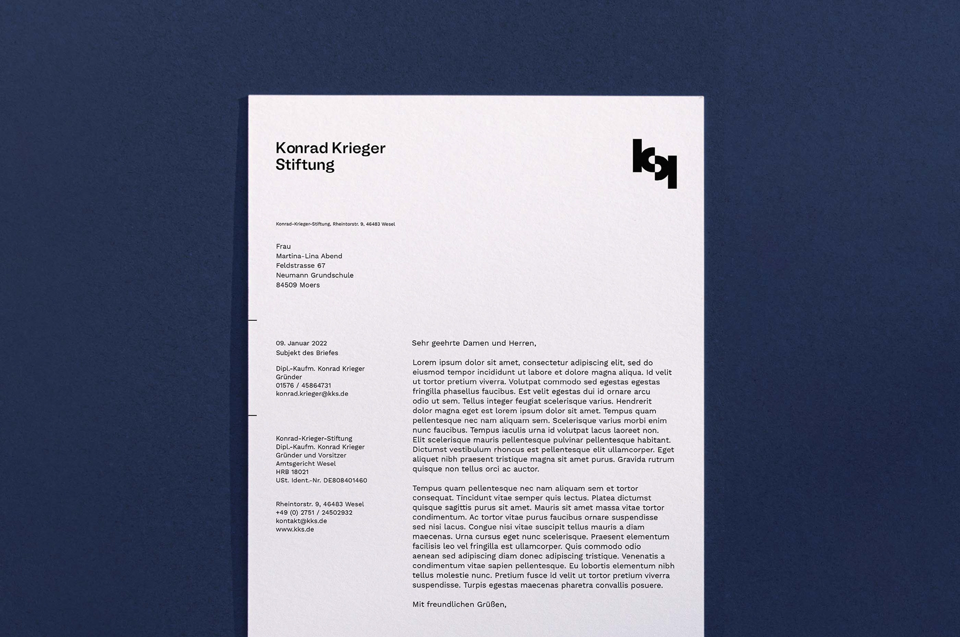
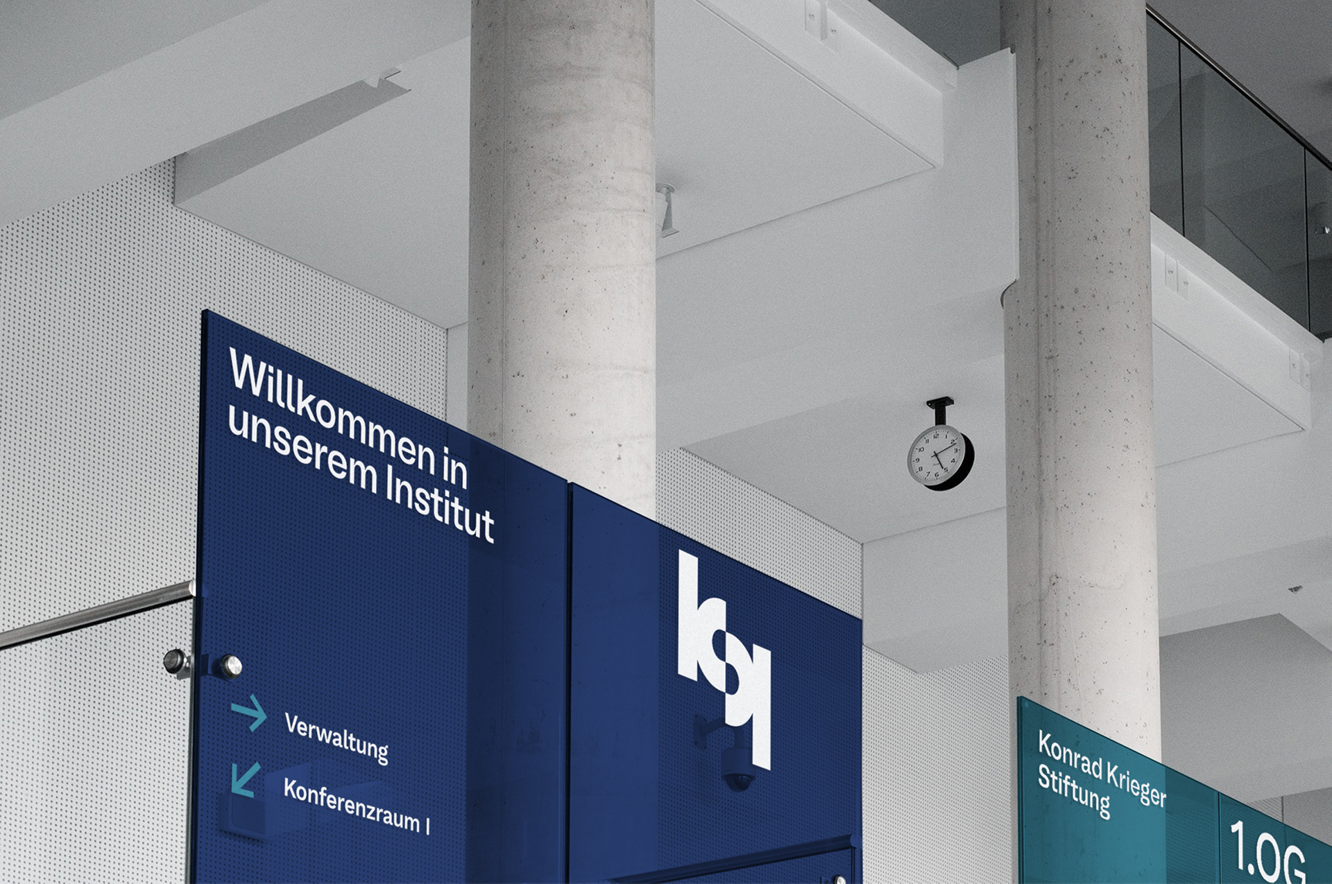
As for the second logo, the approach was a more traditional one, of pure typographic exploration, where the double initial K letters of "Konrad Krieger" are combined to create the S of "Stiftung" using the negative space.
Even though my work ended up not being chosen I believe that the project was personally very successful as a first experience on how to develop a solid proposal for a client and how to pitch an idea in a meaningful but concise way. Looking back, those learnings have definitely helped me build up the experience I currently apply on my daily work.
Foundations


First approach




Second approach
