Train Entertainment Portal - ICE Portal
✍︎ UI/UX Design, User Testing, Accessibility
✐ Figma, Tumult Hype
⚐ Thousands of daily users reached
Here presented is one example of a project that I had the privilege to be part of for many months. The ICE Portal is the on-board entertainment solution of the german national railroad company DB, available to all of its fast train customers after connecting to the train Wi-Fi. The ICE Portal celebrated 10 years of existence recently and has been proven as a useful tool for all passengers.
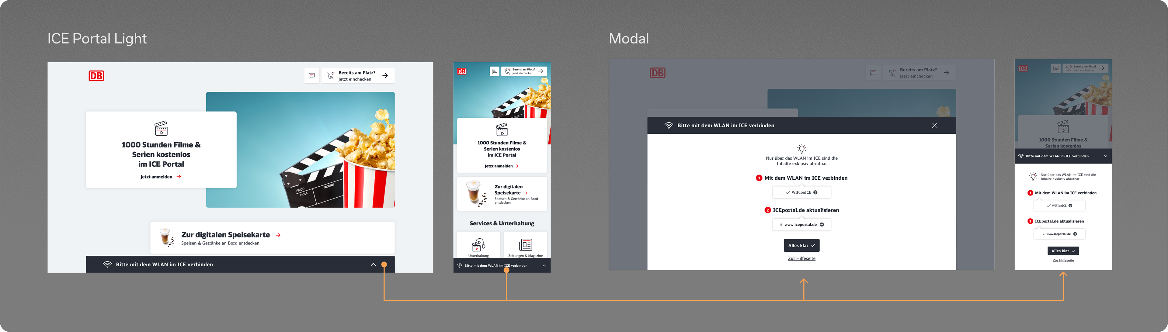
ICE Portal - Light Version
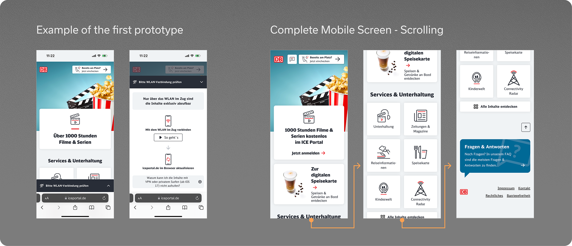
One area of the solution that I worked on was the so-called light version, which is shown to the user in case that there was any problem with the wi-fi connection (which is necessary to access the full version), acting as a sort of initial troubleshooting.
Therefore here the main challenge was to make the page as intuitive and easy to understand as possible, while also maintaining the appeal to passengers as to why should them proceed and could profit from.
In summary, my main tasks involved:
• Designing a responsive UI, including very small mobile viewport sizes;
• Testing and fine-tuning the accessibility aspects of zoomed-in and increased type sizes browser settings, as well as focus states and navigation with the tab key;
• Exploring with the content, look and feel and structure in order to increase the attractiveness of the content;
• Creating and further optimising a fully functional click dummy prototype for the functionality;
• User-testing the prototype in the actual train, collecting feedback and observations about how the users dealt with the page, and analysing the results.
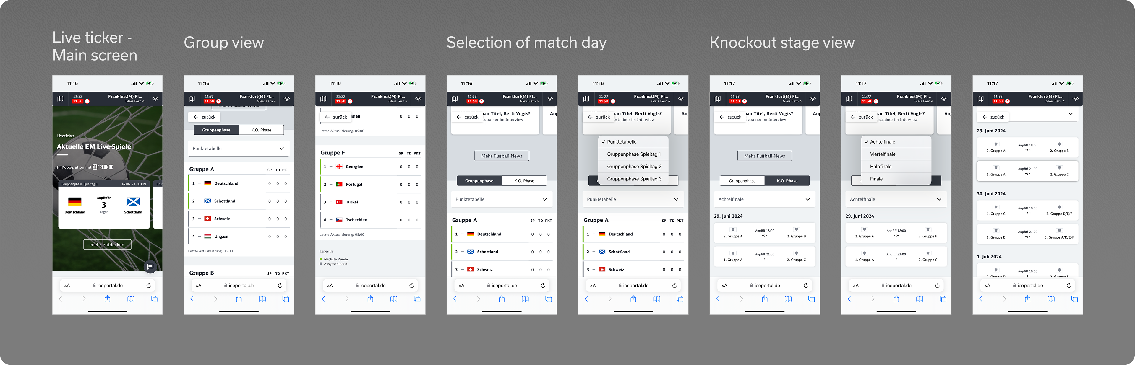
Live Ticker - Sport results
Another area of the portal (and my personal favourite) that I was able to work on from scratch was the live ticker section, that is activated during major sports events like the Europe Cup or the World Cup, and provides the user with live results and many other information of the tournament.
I would say that the main challenges for this task were firstly how to create a comprehensive navigation system for the multiple phases of the competition, and its corresponding table or match-up overview. Furthermore, the information density was quite big and sometimes hard to accommodate inside the smaller viewports, as for example accounting for the myriad of team names, possibility of points, goals, and so on.
In summary, my main tasks involved:
• Designing a responsive UI, including very small mobile viewport sizes;
• Creating different variations for the tiles, tables and other elements according to the viewport size;
• Conceptualise a comprehensive structure for the different competition phases (group stage, knockout);
• Testing and future-proofing of the final designs in regard to future tournaments, with other sports, bigger number of teams, etc.;
• Adapting other existing modules such as teasers, tiles and news to the new content.
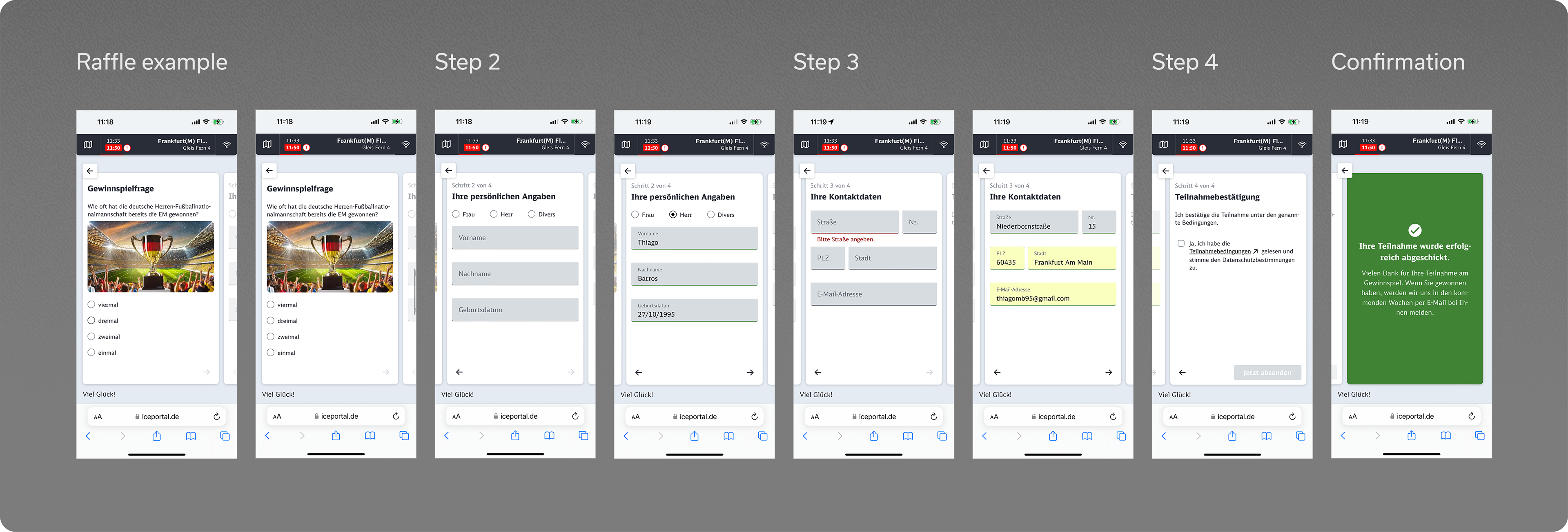
Raffle offers
Finally, a third area that I want to present is the concept and design of the raffle offers, which are occasionally available for the users. These allow to enter a raffle and obtain prizes after filling the personal information formulary.
At first it may seem a quite mundane and simple page, however it is not without a few thinking points, specifically in regard to smaller screen sizes, accessibility and also how to lead the user smoothly through the process.
In summary, my main tasks involved:
• Designing a responsive UI, including very small mobile viewport sizes;
• Testing and fine-tuning the accessibility aspects;
• Exploring with different look and feel concepts, visual elements and other design features;
• Develop a clear and smooth navigation process to engage with the user and achieve a higher completion rate of the raffle entry.